Tuesday, April 10, 2012

Classification methods

This the poverty data in the United States.  In my opinion, the best method for classification of this data  of the Quantile, Equal Interval, Natural Jenks, and Standard Deviation is the Natural Jenks.  The  poverty rates for the U.S. is not spread out evenly across the country. As you can see most states have very little poverty while other have a large impact on it.  The Natural Jenks makes natural groupings to accommodate the data and I think since there are some huge outliers within the data that it works very well.
Histogram of the Natural Jenks 

I noticed when I played around with the classes from 6 to 32 the breaks had almost evenly went throughout the data where the highest percentage of poverty was.  I did this with other classification methods and they did not break up naturally along the data, in fact, they stayed closely to where most of the data was present.

Tuesday, April 3, 2012

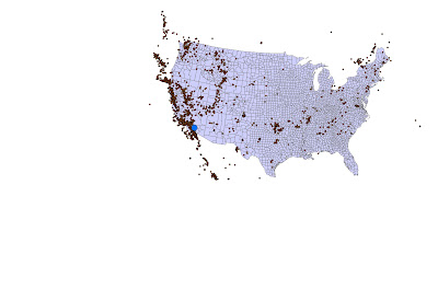
This exercise was using exploratory data with the use of Mean, Median, Standard Deviation and Variance from points taking of earthquake data.

This is the mean center of all the points along with the standard deviation ellipse.  The mean center identifies the geographic center from the set of points.  The ellipse measures the degree to which features are concentrated or dispersed around the geometric mean center.  It shows that most of the earthquakes happen along the southwest of the country.

This is the median center which identifies the location that minimizes the overall Euclidean distance to the features in the dataset.

This is  a Voronoi diagram of the points in the dataset. This shows the collection of  regions that divide up the plane.  Each region corresponds to one of the sites, and all the points in one region are closer to the corresponding site than to any other site.