Tuesday, April 10, 2012

Classification methods

This the poverty data in the United States.  In my opinion, the best method for classification of this data  of the Quantile, Equal Interval, Natural Jenks, and Standard Deviation is the Natural Jenks.  The  poverty rates for the U.S. is not spread out evenly across the country. As you can see most states have very little poverty while other have a large impact on it.  The Natural Jenks makes natural groupings to accommodate the data and I think since there are some huge outliers within the data that it works very well.
Histogram of the Natural Jenks 

I noticed when I played around with the classes from 6 to 32 the breaks had almost evenly went throughout the data where the highest percentage of poverty was.  I did this with other classification methods and they did not break up naturally along the data, in fact, they stayed closely to where most of the data was present.

Tuesday, April 3, 2012

This exercise was using exploratory data with the use of Mean, Median, Standard Deviation and Variance from points taking of earthquake data.

This is the mean center of all the points along with the standard deviation ellipse.  The mean center identifies the geographic center from the set of points.  The ellipse measures the degree to which features are concentrated or dispersed around the geometric mean center.  It shows that most of the earthquakes happen along the southwest of the country.

This is the median center which identifies the location that minimizes the overall Euclidean distance to the features in the dataset.

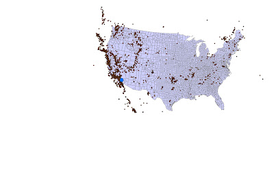
This is  a Voronoi diagram of the points in the dataset. This shows the collection of  regions that divide up the plane.  Each region corresponds to one of the sites, and all the points in one region are closer to the corresponding site than to any other site.

Wednesday, March 14, 2012

This was an interpolation exercise dealing with fecal coliform for the Galveston Bay in Texas
This is the study area.


There was an excel document containing points from GPS from the sample points. I used the "Display X Y  Data"  and adjusted the coordinates to get right projection for the study area, and set the z- value to the Fecal Coliform data that was in the spreadsheet.  When everything was generated, I got these points.

Everything was pretty simple from this point.  All that had to be done was just find the IDW tool, which interpolates the study area from the points.  Also, you have to mask the area so it focuses on just one portion of interest.  You do this by going in the "Environment setting" and under the "Raster Analysis" you set your mask to the study area and I came up with this.

I used the same step from the IDW.  This the Kriging with the default settings.


This is the Spline.  I used the TENSION type with a weight of  5 to get  the smoothness of the curve better.  
The three different interpolation methods showed that from the sample points of the fecal coliform there were a lot more influence toward the upper left where the downtown of the area is located with mostly impervious surfaces. This could mean that the runoff from the city goes into the Galveston Bay would have more of a change then the other parts of the Bay.

Tuesday, March 13, 2012

Unit 4 Sediment transport Index

I started out with a DEM from the CGI.  This is Oakland County of Michigan. 
This the Fill
Flow Direction

Flow Accumulation 

I added a new shapefile to create a point on the streams to get the Watershed

Next, I used "Extract by Mask" tool from the original DEM and the Watershed 

Generated the Slope
I used the raster calculator to put the Sediment Transport Index formula in "Power("watershedFlowAccumulation " / 22.13,0.6)  * Power(Sin("Slope_Extrac1"  / 0.0896),1.3)

Monday, February 13, 2012

Watershed Lab

This lab was about learning to do the watershed.
I started out with obtaining a DEM from the USGS Seamless Data Distribution Website from this link http://seamless.usgs.gov/.  I picked New York with Niagara Falls. This picture is the "Fill" of the DEM.
Flow Direction 
The Flow Accumulation 
This is the Flow Accumulation with the streams greater than 3,000 using the raster  calculator. 


Flow Length

Added my own point shapefile to go right on top of the streams. This created Pour points for areas of interests.  The colored portion  are the watersheds that go through the pour points.

Behold! I also used model builder.  It shows all the steps I took.

Wednesday, January 25, 2012

Assignment 2

In this assignment, Wine flavors are directly influenced by factors related to where the grapevines grow, especially soil, climate, elevation, slope, and slope aspect.  We wanted to find the suitable sites for a winery and vineyard areas.
We first started with the base map.
Then I put the elevation layer of the site of interest on to the base map.
I used the Aspect tool, to show where the sunlight is coming from.  The South and the Southwest locations that have an aspect between 157.5 and 247.5 degrees are optimal for maximum sun exposure.
This is the slope. The green and yellow areas of the slope raster represent gentle terrain, while the orange and red areas represent steeper areas.

The cells in orange are sloser to freeways and are considered more suitable for a vineyard than areas in red and blue, which are farther away.  This was considered because winery customers would be close to be able to find it.

In this one, I had to manually recalculate the aspect from the previous one to get them into a ranking scale of 1 to 5, with 1 being least suitable and 5 being the most suitable. 
This time I reclassified the distance to the freeways.
And here too, I reclassified the slope.

This is what I came up with.  Since I reclassified  the slope, aspect, and distance to freeways I could  now use the weighted overlay tool.  I then had to assign percentages of influence of relative importance that would all add up to 100. The aspect was 50%, slope was 30%, and distance to freeways was 20%.


The most suitable vineyard are in green.


First Class Assignment

I used ArcGIS 10 to do these along with the Spatial Analysis tools.
First, I calculated the Slope for the surface of Wayne County, MI
Then, I calculated the profile curvature of Wayne County
The hillside also was calculated.

The Aspect tool was used to show the direction of the sunlight that hit the surface in this map
And lastly, I converted the DEM into a 3D TIN and this was the result. Since this is Wayne County, the surface is relatively flat, so not much is shown; at least in 3D.